Lorenzo--- August 2014
By Lorenzo Princi
What is it with poetry?
Poetry has always been there. From when I was very young, reading song lyrics from album booklets and dabbling in bad puppy-love poems for my latest childhood crush. Rhyming you with do over and over again got boring though and when I hit my teens I was drawn to music that did a little more than that with its lyrics.
Neil Peart’s work with Rush stands out and songs like subdivisions from their signals album were hitting home with my own adolescence. Lines such as, “nowhere is the dreamer or the misfit so alone” felt like they were written just for me. Of course my love of music didn’t end with lyrics and soon I was dreaming of designing album covers like every graphic designer starting out. Since I enjoyed writing much more than I was good at it, I pursued graphic design instead and began studying in the early 2000s upon moving to Sydney. What I soon started discovering about typography blew my mind; I had no idea how much science was involved.
Though the vector graffiti movement was breaking out at the time and suffocating the mainstream graphic design and advertising landscape, I found much more inspiration from concept led works such as Mmm... Skyscraper I Love You by Tomato. My biggest influence however was the technically perfect works I found in European design book such as those published by Niggle.
Type and poetry go hand in hand and I was desperately trying to find ways to incorporate poetry in all my student design projects. I wrote poems about everything; my travels to Design Centre Enmore (where I studied), the typeface Bembo and just about anything else I was working on. My interactive homage to Dante Aligheri was a Nine Circles of Hell website which featured contemporary public figures inhabiting each circle in place of Dante’s original characters.
So between reading, studying and listening to progressive rock, I wrote poems, lots and lots of poems. Few if any, did I dare share; some were too personal but most were just bad.
In recent years, my book review/cover mock blog Blurb Hack and other personal projects have taken a lot of my personal creative time, fulfilling a need to design things which don’t have a client or deadline. After some caffeine induced inspiration however, I decided to start putting my poems out there with a concrete poetry approach. The thought of sharing them no longer worried me, maybe because I’m older or maybe because the visual representations somehow made it all less daunting.
So just like that, a few pins later and I knew Blurb Hack would have a new and ongoing challenger for my free time.

Words over form
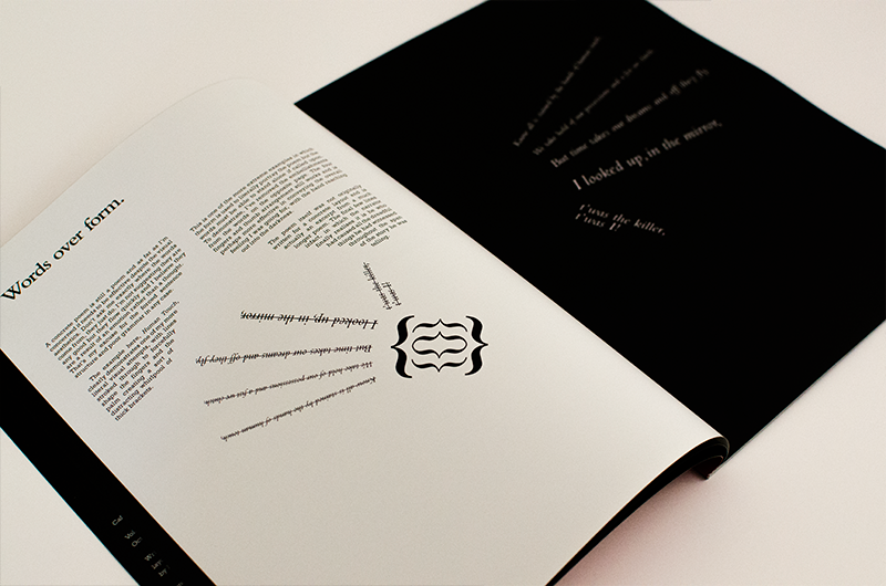
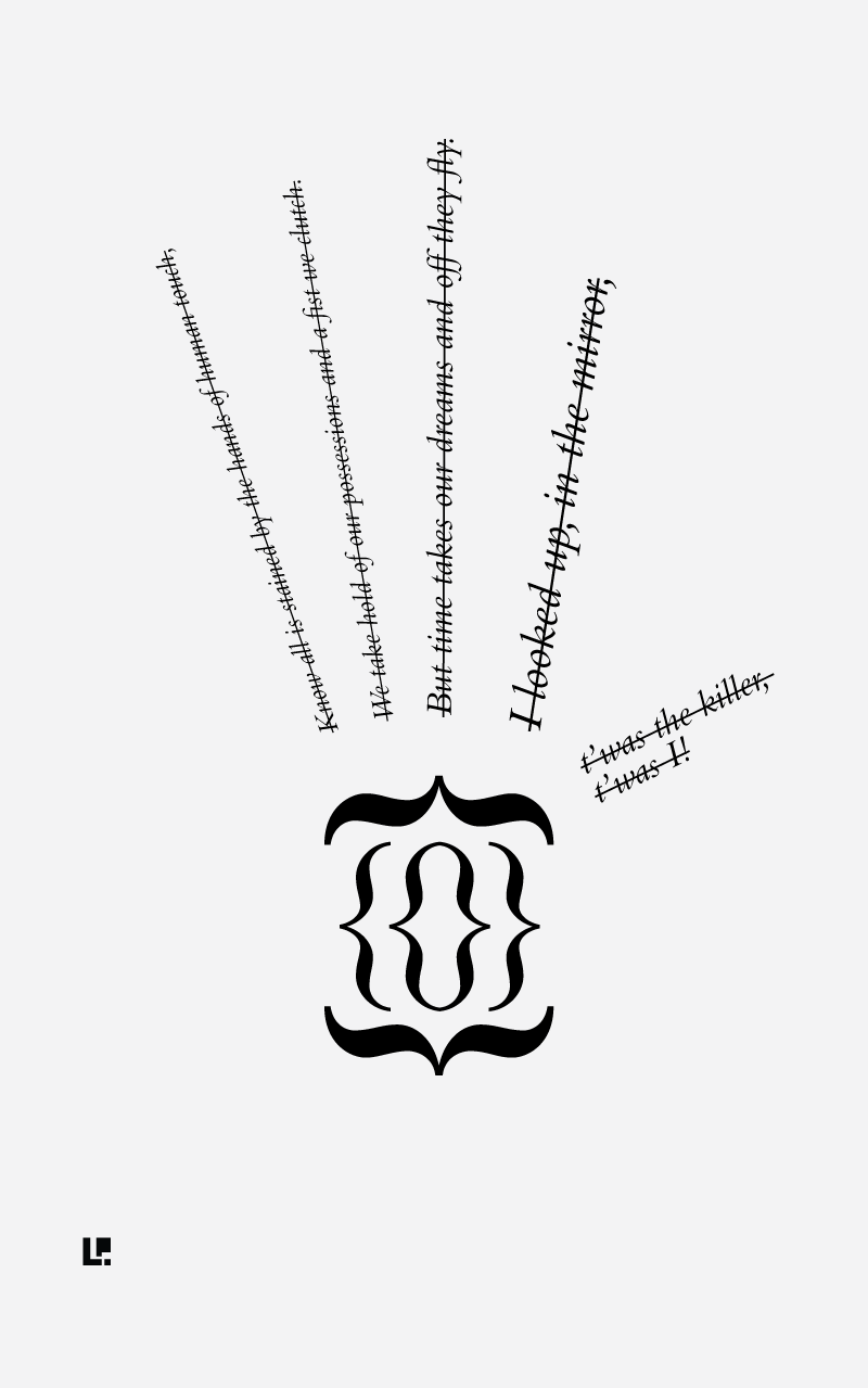
A concrete poem is still a poem and as far as I’m concerned it needs to be effective despite the visual aesthetics. Don’t ask me exactly where the words come from, they just do. I’m not suggesting they are any good but they flow quickly and I believe they are a result of an emotion rather than a thought. That’s my excuse for the forced sentence structure and poor grammar in any case. The example here, Human Touch, clearly demonstrates one of my more literal visual attempts, with lines stroked through to forcefully shape the fingers and the palm creating a sort of distracting whirlpool of thick brackets.

This is one of the more extreme examples in which the form is used to literally portray the poem but the words must be able to stand alone if called upon. To demonstrate, I’ve removed the embellishments from the words on the opposite page. The four fingers and thumb arrangement still works and is perhaps more effective in conveying the overall feeling I was going for, with the hand reaching out into the darkness. The poem itself was not originally written for a concrete layout and is actually an excerpt from a much longer poem. The final few lines infact, in which the narrator finally realises it is he who had caused all the dreadful things he had witnessed throughout the span of the story he was telling.
How?
So how to get started? Easy really. We live in a world where excuses are becoming harder and harder to validate. Doing or not doing (more than ever) really only boils down to effort. The administration surrounding creative projects has all but been removed. Professional tools basically come on mobile phones and everyone has access to the best distribution network in history. Only the effectiveness of its use really factors in terms of success metrics, if that is important to you.
I was reminded the other day, that only 13 years ago I was creating a website from scratch to review my favourite albums. The code was messy, the content was static and no one had enough internet to even load it. That being said, I was still able to reach a band in the United States with it and they thanked me for the positive review by putting my name in the acknowledgements on their follow-up album. The world was already shrinking.
Fast-forward to today with social-media outlets, various easy-to-use website builders and readily available professional tools all at your fingertips, it’s never been easier to create something. Suffice to say it didn’t take me long to get my poems from Illustrator to Pinterest and out to my wider social-media network. Seeing as the actual effort was going into the work itself and not the administration, it didn’t take long for me to start taking things further and turn the poetry into the basis for this magazine. Less than a week actually.
With services like blurb.com and other self publishing sites, it is now possible to get high quality production values, on-demand, without breaking the bank. So no matter whether you have 1 follower or 1 million, if you have something to say, say it. Create a blog, write a song, code an app or just take a photo of something interesting and share it.
Creating a set
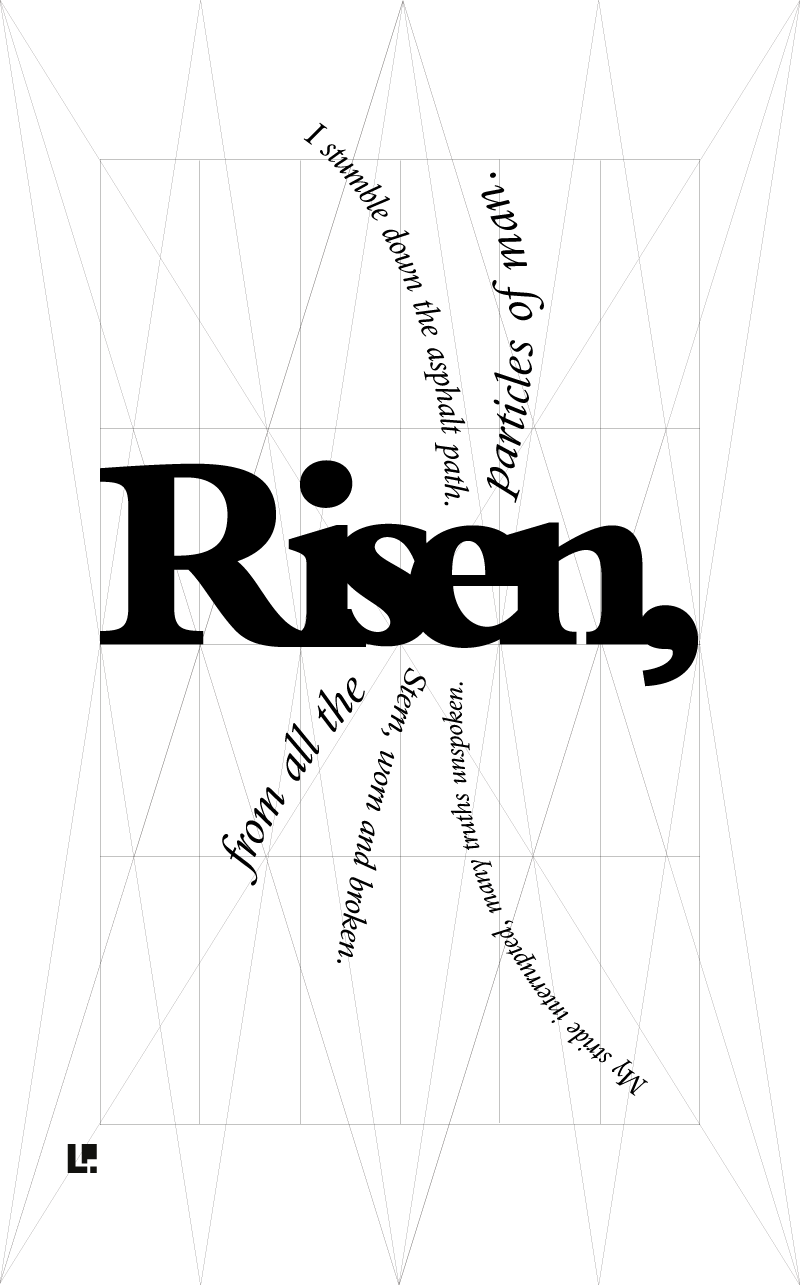
I really wanted the concrete poems to have a sense of brand. A clear visual aesthetic that would present them as part of a set. Since I always lay some ground rules on a project before I begin, this was relatively straight forward to accomplish. For the concrete poems I decided on proportion, where my logo would sit and a black/white colour scheme.
The diagram below shows the grid and stars I use to keep my layouts balanced despite their often free-flowing forms. I’m a designer by trade and feel my training to work within strict constraints actually helps me be more creative. Laying these ground rules ultimately meant that the consistency would help fit each individual piece together like leaves of a book and help to tell a greater narrative.

Another rule (which I’ve broken and bent here and there) was to make Bembo the typeface family for the series. As I wrote years ago in a poem, it is like a beautiful, sophisticated lady and the perfect fit for poetry.
The last and most important rule in the exercise was to never use an element that can’t be created without a typographic character. This could include anything in a font character set including ornaments but never anything created using illustration.
